Product design at Cazoo
Multi-faceted role at an emerging power in the automotive industry.
From creating a design system to elevate internal teams, to working across product worlds supporting the launch of key business initiatives across the United Kingdom and Europe.
Teams include; Design Systems Ops, CRM, Mobile squad, Internationalisation
Design systems and CRM
During my time at Cazoo I’ve worked as a member of the design system ops team, supporting the build and launch of the business DLS (Design language system).
A Design system is a shared language, that contains design standards, principles and documentation. As well as toolkits like themes, UI libraries and shared components to use to work towards common goals. It is a living, breathing system… figuratively speaking.
What?
My first major project at Cazoo was to build a design system for the CRM team. The UI kit was informed by our Cazoo style guide. Once completed, it would enable us to create faster digital experiences that were both modular and scalable.
Why?
Enable us to create a unified language within and between cross-functional/cross-border teams. It was a crucial factor in our scalability efforts which was a keenly monitored OKR
To allow for visual consistency across channels
To optimise our emails by creating a library of reusable components
Streamline ways of working to reduce tech stress and enable faster speed to market
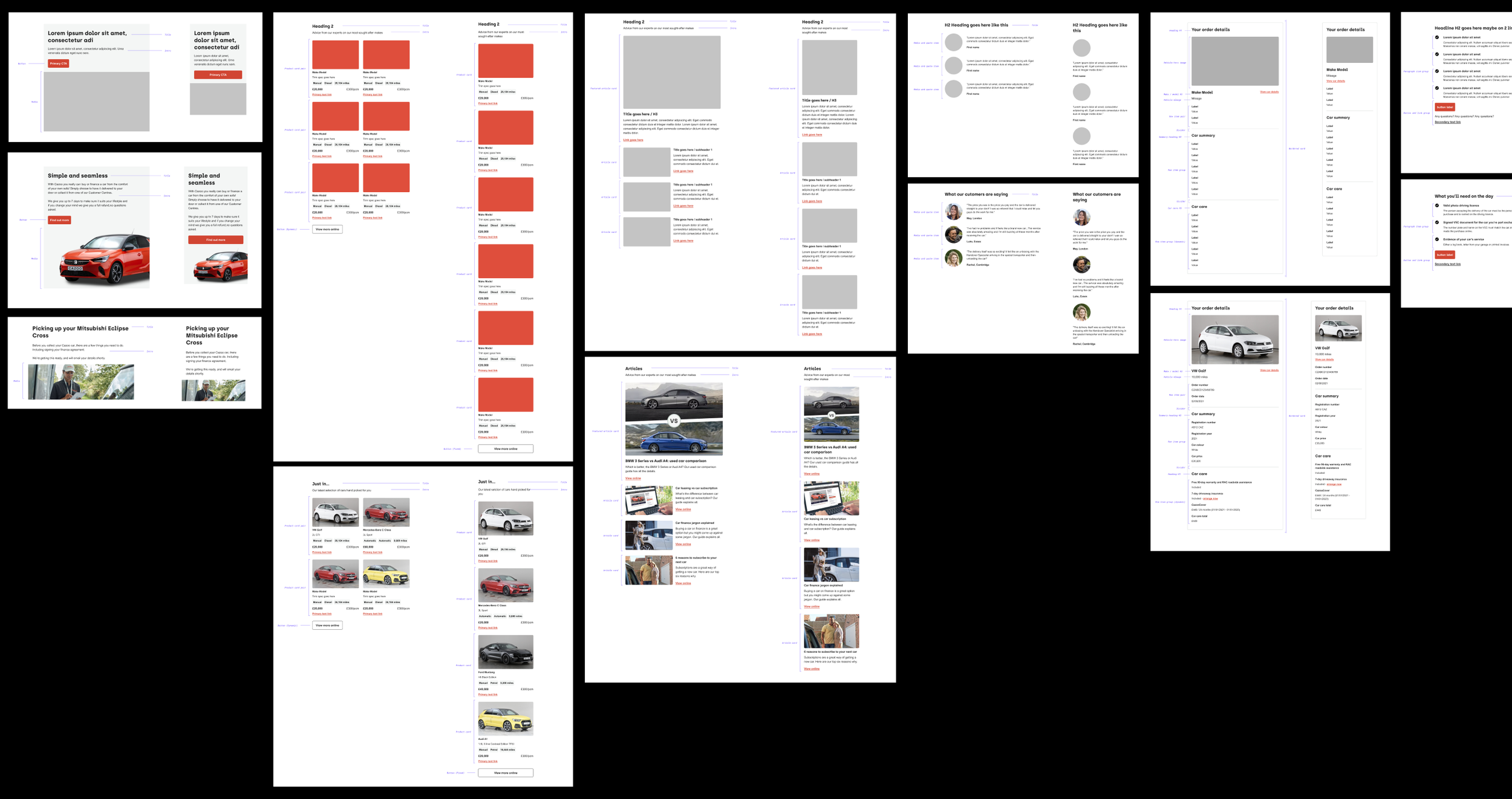
A few screenshots…


My process
-
I began my discovery by auditing existing emails and introducing quick optimisations. Low effort, and high impact.
These included;Optimising for accessibility
Removing text from images
Focussing on functionality before delight
Presenting content in a scannable and digestible way
Introducing a mobile first philosophy (as >60% of our cross channel traffic was from mobile users)
Ensuring information hierarchy reflected the objective
Streamlining CTAs and removing cognitive load by reducing action points
-
To get an idea of how other companies make their emails work. What are other business doing well? What works? What doesn’t? How could these experience be improved? What are we going to introduce to our own designs?
-
We took inspiration from Brad Frost’s ‘Atomic design’ for the build approach for this system.
”Atomic design is methodology for creating design systems.” Essentially it means building from the ground up. -
The foundations are the visual and structural principles of our design system. We can consider them to be the rules that are at the very centre of our designs.
The primary foundations of this system included;
Colours
Typography
Spacing rules
Layouts
-
Atoms are the smallest building blocks of a design system. Although not particularly useful on their own, they inform the way we build molecules, and in turn components. Their inclusion allows us to understand the fundamental parts that we are working with.
In our case the library of atoms is small when compared to more complex design systems, and indicator of a sturdy and modular library of assets. -
When atoms are combined to create more intuitive elements, the result is called a molecule.
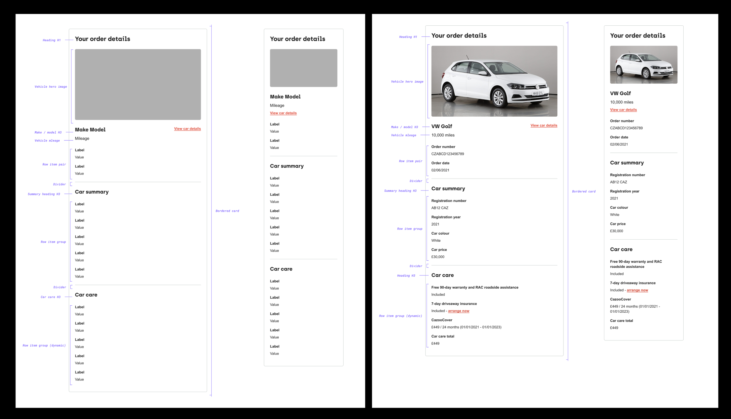
We create content blocks through combining molecules.
-
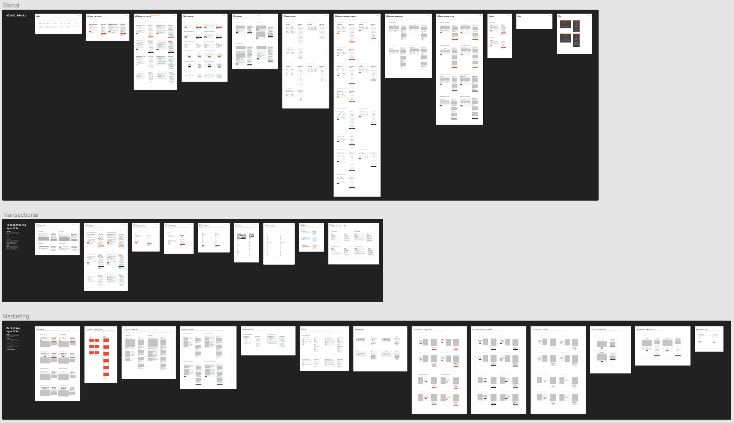
Content blocks are created by combining molecules. We introduced three block styles;
Global
Transactional
Marketing
‘Transactional’ and ‘marketing’ content blocks were in line with our two high level journey types. ‘Global’ blocks we built for to suit both. We decided as a team that we wanted to create a clear visual differentiation between transactional and marketing emails, we therefore designed each style against a set of specific principles.
Principles for transactional emails;
Informative. Give the customer access to all the information they need in a digestible format
Reliable. Build trust between Cazoo and users
Task driven. The purpose of these emails is to ensure that our customers have access to everything they need
Intuitive. Give the customer the freedom to create their own journey that suits their needs. / help the customer to personalise their own journey
Primciples for marketing
Authentic. Genuine, thoughtful communication of our props and value
Focussed. Communicating the right things to the right customers at the right time
Confident and customer led. Not desperate, we believe in what we offer. We help the customer find the right car for them. For example, instead of “please buy our cars” we opt for “let us help find the right car for you”
Trustworthy - speaks for itself
-
For this project, was worked on alongside the design process.
I collaborated with content design and developers to create detailed documentation, complete with usage guidelines and design recommendations for this asset library
-
Feedback
Throughout the process, there were regular check-ins with the teams. I’d contribute at design critiques, stakeholder updates and a number of other ceremonies.
Workshops
With regards to workshops, I’d conduct these on a regular basis. Ensuring that the team were happy was a number one priority, as they were to be the ones working with the designs. For the design system to be a success it truly had to be a collaborative effort - nothing was completed behind closed doors.It was important to hold onto the mindset that we had two users; customers would be interacting with the designs. But the team, both strategic and technical would be bringing them to life.
Testing
Stress testing the designs was straightforward. However technical testing was a challenge.For a long time we had to work a way around a lack of technical resource in the team. This meant that to keep moving forward I had to make assumption based decisions, before getting the opportunity to pair with any devs.
I knew that HTML coding had it’s limitations, not to mention the email clients themselves - it was a tricky.
Eventually, developers were drafted in and the designs were finally put to the test - fortunately we weren’t set back too much and there weren’t any major changes that needed to be made. Just a few tweaks.
Learnings and impact
-
The process of introducing a design system to CRM presented a great deal of challenges, and opened our eyes to the disconnect between CRM and product.
Through this piece of work I was able to integrate nicely with the CRM team and as trust was built, introduce them to product ways of working.
As a result this became more than a design system project, it was an opportunity to create alignment and introduce a team operating in waterfall, to more agile ways.
The CRM team had previously been considered an after thought when launching/optimising products. We (the design ops team) were able to educate all parties about the importance of including CRM and post-web touch points as early as possible, as they were an instrumental part of the end to end design process. -
Established visual consistency with web
Directly impacted team productivity by reducing technical strain
Contributed to a smoother transition in to European markets
Through collaborating with CRM and leveraging my connections with product teams, I was able to bridge a gap between the tech and customer worlds. I created working relationships that hadn’t previously existed which was a great success all round
Design System Ops Cont..
As well as taking the lead on the CRM Design System, I contributed to the discovery and introduction of ‘Cazoo UI’ - the overarching DLS at Cazoo.
Responsibilities included
Introducing a Design System for CRM team (as detailed above)
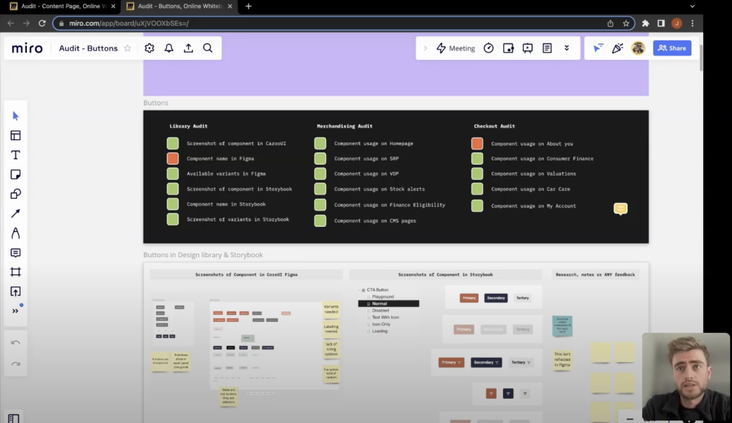
Running a complete component audit across web
Collaborating with designers across product worlds and get buy-in for our vision
Presenting discoveries at team meetings and shareholder updates
Recording video updates to keep the wider product teams up-to-date with what I was working on
Component Audit
Not the most glamorous design task, but extremely important to what we were trying to achieve - synchronicity and purposeful design across product worlds.
Why?
To better understand how different components are being used by each team - these were the people we were designing for
To better understand designers and product owners
Help us identify and quantify any inconsistencies across web
Share with teams and keep them engaged - we wanted to create a positive attitude to what we were trying to achieve
What needed to be considered moving forward? What should we include in our documentation? How can we cater our system to suit ALL teams? What can we do to make this library and user friendly and impactful and we need it to be? These were important questions that needed answering.
Screen capture of the Typography audit I ran featuring with type styles and HTML classifications across all high traffic web journeys.
Video tutorials
What was the purpose?
Give teams and stakeholders visibility, of what we were doing
To remind teams that the audit wasn’t a critique of their work
Demonstrate the scale of the task at hand, and quantify inconsistencies
To start conversations and give everyone the chance to get involved
I wanted people to know that this project wasn’t a critique of their work, or design decisions - It was only to give us all a picture of the state of play, and was to help inform our strategy moving forward.
Mobile app and concept work
I collaborated with the mobile team on the maintenance of our subscriptions app, and the design of a Cazoo retail app.
This role involved; Optimising our Subscriptions app, ideating for our new app, facilitating user interviews, competitive analysis, user flow mapping, journey building, screen designs, prototyping, and sharing ideas with key stakeholders.
It was a great opportunity to develop a better understanding of design principles for iOS vs Android.
Example search and browse user flow for native app
Concept screens for retail app
User research and proposition launches
Cazoo has expanded significantly since I joined, that’s in terms of business propositions, market share, and European presence. As the company has grown so rapidly, it’s presented opportunities to get involved in new projects, i’ve played key roles in the launch and optimisations of the following;
Sell car and part exchange (Buying cars from customers)
Car subscriptions
Finance / finance eligibility flows
Car care + vehicle add-ons
It’s also provided opportunities to collaborate with researchers, and build relationships with users. I’ve developed skills in;
Unmoderated user testing
Facilitating user interviews
Prototyping
Note taking
Synthesis workshops
Understanding our customers is paramount to creating game changing experiences and I never shy away from an opportunity to conduct research first hand. I’ve gotten involved in both leading and supporting capacity
Internationalisation and scaling components
Having proven myself in CRM, Design Systems Ops and Mobile I’ve been tasked with a new challenge…
I’m currently design owner of the Internationalisation team, where we are scaling components across Europe and localising the Cazoo experience to fit consumer and market needs.
This is a new role, details of which will be uploaded soon.


