Maritime & Coastguard Agency
Project: Digitising application process for a government service.
This project lasted a total of 16 weeks. 8 weeks discovery, followed by an 8 week Alpha phase, culminating in a GDS (Government Digital Service) assessment.
-
The MCA is a government agency, sponsored by the Department of Transport.
“The Maritime & Coastguard Agency (MCA) work to prevent the loss of life on the coast and at sea. We produce legislation and guidance on maritime matters, and provide certification to seafarers.”
-
Many of the MCA’s current systems, databases and practices are outdated and resource intensive to manage. Challenges include;
Inefficient, manual processes
Fractured user experience
A complex industry with complex access needs
Lack of reporting and documents not stored in a central location
Complex and varied customer base
Customers unaware of how their applications or queries are progressing
Security for user based access and user identification
Customers and staff alike are dealing with multiple MCA teams to complete a single goal due to poor communication and dated processes
-
Provide customers with the ability to carry out their business online through a single point of entry and role-based access, enabling them to see information and access digital services pertinent to them, their company and their role.
-
We proved that it was possible to digitise the process, despite the ranging complexities
We were able to successfully demonstrate the value of digitising the application experience, both for the MCA and it’s users
We achieved buy in from GDS legislatures, and investment to develop the service further, as well as the broader MCA experience
Discovery
We kicked off the project by interviewing different MCA user groups to get a range of perspectives and experiences. We chatted with 12 Seafarers (crew members), 7 Vessel Operators, and 12 internal stakeholders.
We chose seafarers as a smart focus for Alpha due to the breadth and complexities of their interactions with the MCA.
The most complex of these interactions was the ‘Certificate of Competency’ application process that seafarers need to complete in order to receive their maritime licences. A process the MCA was keen to digitise, due to the volume of applications that they handle (Est. 7500-9000 per year).
We identified 5 key needs for seafarers, when it came to improving the application process, the ones in bold are the areas around which we focussed.
Ability to submit information once (less repetition)
A clear understanding of the process and requirements
Ability to track status
Ability to manage certificates and forms online
Flexibility to make changes to data/bookings/applications
Research informed opportunity statement:
To empower seafarers to gain control and visibility of their Certificate of Competency application and streamline the service utilising technology and business process changes.
Design
We kicked off the design process by mapping out existing user journey for the certificate application process, before running team ideation sessions around key themes that came from the initial research sessions.
Early ideation was done on pen and paper. I then moved on to wireframing, higher fidelity designs, building prototypes fit for user testing, and eventually a prototype to demo as a part of the scheduled GDS assessment in front of Gov UK representatives.
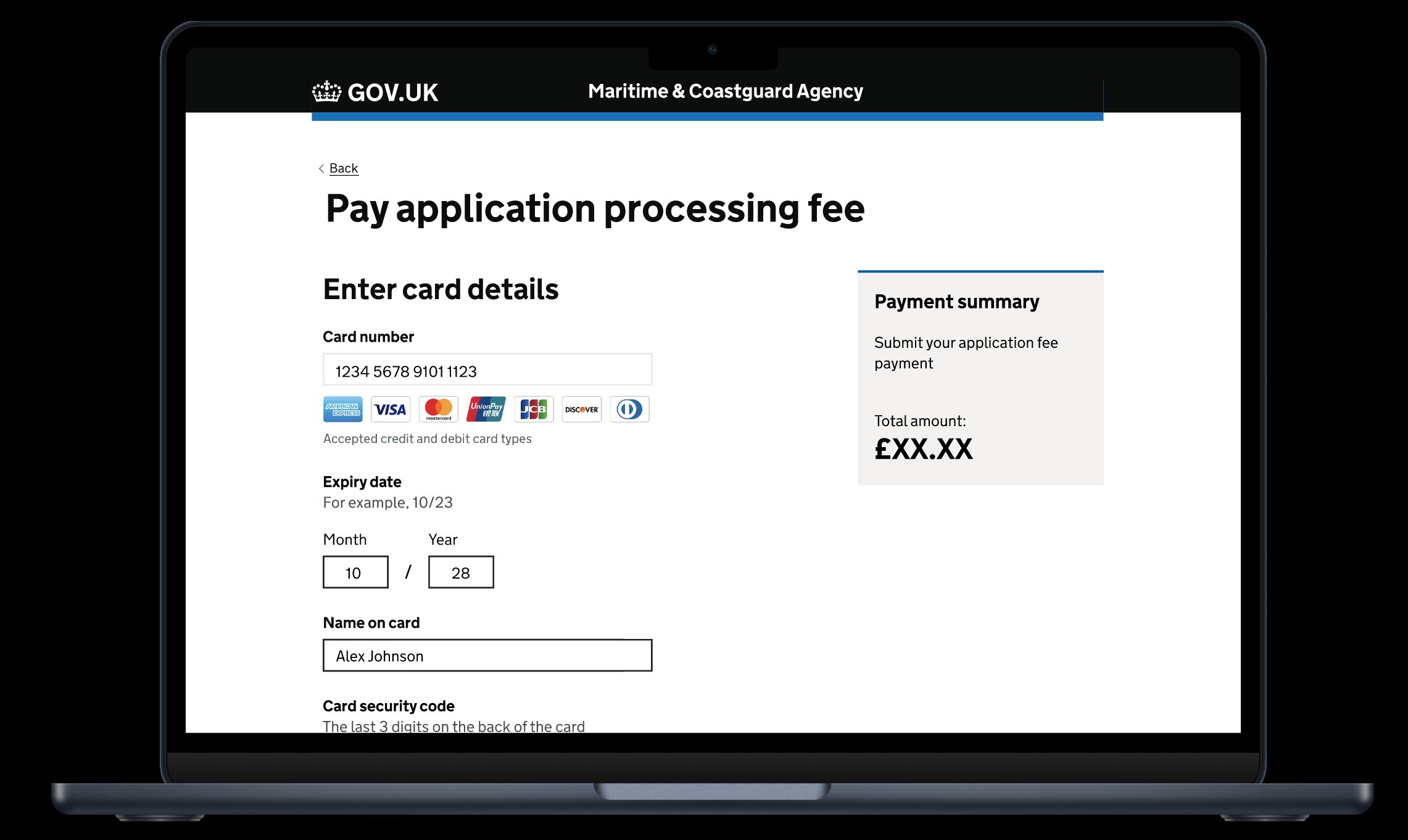
Knowing that the GDS assessors would challenge the design decisions i’d made and the patterns i’d used, it was essential that I designed the service in line with gov.uk principles throughout.
Considerations lncluded;
Components and patterns. Used appropriately, and consistently
Colours. Used effectively, and purposefully consistent within our own designs, as well as other GDS services
Button styles. Consistent throughout the flow and in line with GDS standards
Typography. Used GDS Transport typesets, with GDS recommended sizes for consistency and accessibility
Spacing scale. Adhered to GDS 5px spacing scale
Accessibility standards
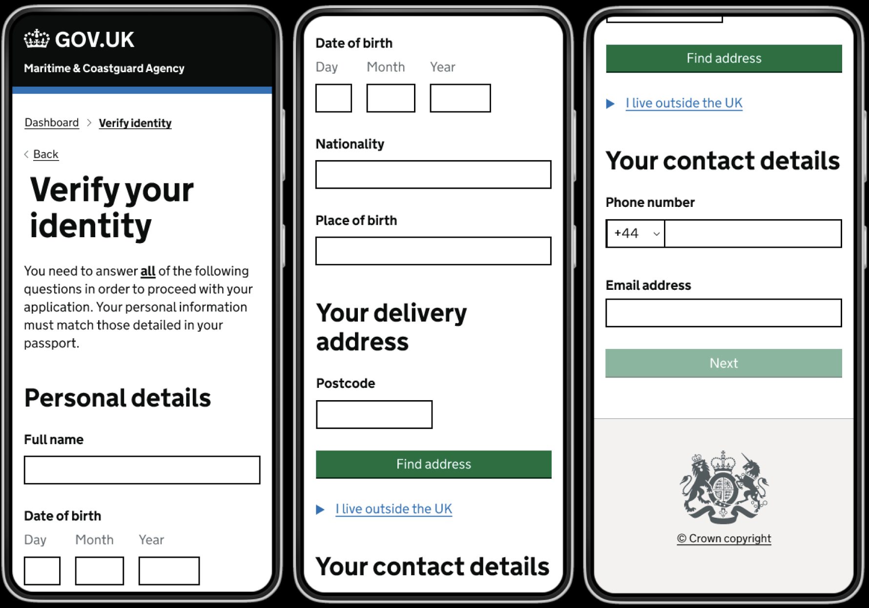
Mobile
Our focus for this Alpha was on the desktop experience, since the users we spoke to primarily said that they would prefer to do their applications on a larger screen, such as a tablet or computer.
However, we needed to demonstrate a consideration for mobile users too, and a consideration for users that may need to access MCA services at sea, in temporarily restrictive enviroments.
End result
In order to solve the whole problem for users, we worked directly with service users to understand their needs throughout the entire Certificate of Competency application journey. We tackled a number of different challenges across the process;
The new service is simple and easy to use
Everything exists in one place. Users have full visibility over the whole process, this was previously a huge pain point
Users can clearly see where they are in the process
Users have control over the information they see, and the notifications they receive
Users have time and space to review their submissions
We have provided straightforward access to other communication avenues
Impact
We proved that it was possible to digitise the process, despite the ranging complexities
We were able to successfully demonstrate the value of digitising the application experience, both for the MCA and it’s users
We achieved buy in from GDS assessors to invest more time and resource into further developing this application process
We unlocked further resources to look into the broader MCA experience, and where it could be developed

